
Buttercup Tutorial
- Sarah Frey

- Aug 28, 2025
- 2 min read
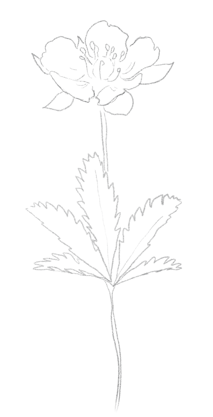

The Vibe: The summer sun killed the grass along the highway, and the wildflowers took over. Bright yellow buttercups stretch toward the sun and wave to us from the roadside.
Throw some wildflower seeds in your backyard, turn on your favorite feel-good album, and let’s paint.
The Playlist:
The Materials:
Water cup
Paper towels or cloth
Watercolor paints of your choice (see color palette below)
Mixing palette/plate (I recommend ceramic or porcelain for easy mixing)
Brushes (I recommend a no. 6 and no. 2 round)
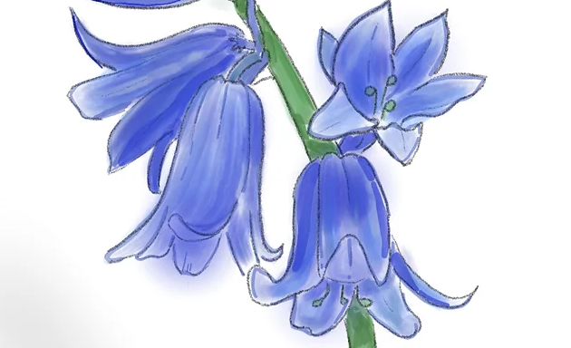
The Color Palette:
For this piece, I primarily used three colors: yellow ochre, lemon yellow, and earth green/terra verde.
Go outside, listen to the breeze, and let’s paint.
VIDEO TUTORIAL COMING FALL 2025
Step-By-Step Instruction:
1.iSet the Scene | On a flat surface, set out water, paper towels, paints,
a mixing palette/plate, and desired paintbrushes. I recommend a no. 6 round brush for washes of color and a no. 2 round for details.
2. Prep Your Paints | Put a water drop on each color to “wake up” your watercolor. Before painting directly on the page, mix colors & water on your mixing plate to get your desired shade.
3. Use Water Wisely | More water = lighter color. Less water = bolder color.
Play with both! You can use the back of the title cards for practice. If you experience pooling, your brush is oversaturated - dab it on the paper towel. You can remove pooled water with a clean, dry brush.
If you are getting rough lines, try a little more water and/or more pressure.
4. Start Light | Begin with the lightest areas first—watercolor is transparent, so it's easier to add darks than take them away. Less is more. Put down a light wash of color over each distinct area with your larger brush first - avoiding any areas that you want to keep white/general highlights. For example, use a light wash of lemon yellow to color in the petals and a light wash of green to paint in the stem and leaves.
5. Layer Slowly and Add Details | Let each layer dry before adding more color. This helps avoid unwanted blending and keeps colors vibrant.
Using less water than your initial wash for a slighter bolder hue, use your no. 6 brush to add shadows and use your no. 2 detail brush to follow the outlines in each distinct area. For example, use a mix of your lemon yellow and yellow ochre to outline each petal and color in the detail creases & stamen, then use a bolder green to outline the stem and leaves and color in their detail lines.
6. Embrace Imperfection | Watercolor is fluid and unpredictable—
that’s part of the magic. Don’t get too hung up on copying the samples. Every flower is unique!
7. Let It Dry Completely | Before mailing or displaying, make sure your
piece is totally dry to avoid smudging!


Comments